From looking at other people's work (e.g. work- See previous journal entry regarding make up) I knew basically what type of looking I wanted.
Base for Everyone:
White Butoh make up all over the body (except what's covered by clothes)
-Use a moist sponge to apply th
e white body paint.
-The actors can do this themselves in the performance night in order to save time.
Details:
Depending on each person's sin (which sin they are in charge of directing, e.g mine is pride) I will create a pattern that relates to their sin.
Possible patters:
-Colours
-Symbols
-Texture (e.g b
ody paint, fake eye lashes, mud etc.)
I choose to use different colours to individualize each person based on their sin. I will also create a slightly different look/patterns in order to make it more interesting.
Together with the group, we came up with these colours for each sin. They are based on our personal perception of the sins, as well as the designated colours for each sin according to http://wiki.answers.com/Q/What_colours_are_for_the_seven_deadly_sins.
Gluttony: Orange
Sloth: Blue
Envy: Green
Lust: Red
Anger: Black
Greed: Yellow
Pride: Purple
From previous creative projects such as paintings, dance, poster making etc. I've learnt that I find it easier to create something creative. using the technique trial and error. In other words, you try it until it feels right! So, in order to create my designs, I tried doing body art on myself.
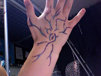
I started off by trying simple patterns on my hand using a liquid eyeliner.

I used one purple liquid eye liner and one green liquid eye liner. For this trial, I copie
d the design from another artist. (see previous post on "Make Up Research"). I wanted to make sure I could master the technique first before I went on to creating my own designs. At fist it was fairly challenging, especially to get the lines smooth, but I got soon more confident and it became easier. I'm quite pleased with
the final look, and I wish
to incorporate a similar feel/atmosphere to the final look.
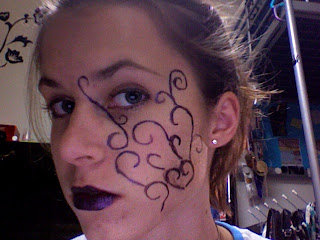
After practicing the technique, I went on to creating my own designs using trial and error. But this time, I tried it on my face.

Once again, I used liquid eye liner. It was a bit harder to
draw it on my face, rather on my hand, but I think it's much more effective on the face.
I like the ide
a of using twirls for the look of pride (e.g the one above my left eye) as I think they look aesthetically pleasing and fairly self obsessed/prideful.
I added purple lipstick to create a bolder and more chocking look. I plan to use the same colour for the details/coloured parts and the lipsticks for each person.
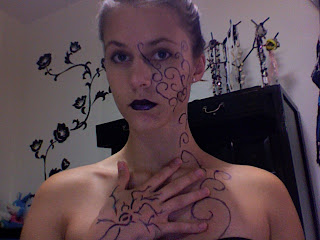
After this, I decided to try an even bolder look (seeing as this is stage body art, it really has to be extreme in order to be seen and influential). To do
this, I added more colored parts. For the final performance, I plan to add small details/colored parts on the face, arms, neck, chest, back and hands.

I believe this looks better. Remember- our bodies will be painted white and therefore the colored details will hopefully stand out more.
Finally, I tried this look with a Butoh face to see how the audience would actually experience this look.

Here one can really see the final look. I really like how the somewhat charming/smooth make up clashes with the butoh face, and this is something I believe relates well to the idea of Butoh. By not having "grotesque" make up (e.g wrinkles, eye bags etc.) the grotesqueness in the movements and faces is really emphasized. With a normal face, we will look somewhat normal (but hopefully creative), but once we start moving, the make up helps to bring out the ugliness and grotesqueness that Butoh dancer aims to arouse by providing a contrast (make up vs. ugly movements & faces).
I'm fairly pleased with the designs I came up with, and I plan to use a very similar look for pride. However, for the other sins, I plan to alternate the colored detailed parts slightly (e.g more curves, less curves, straight lines, thicker lines etc.) in order to create a more creative look.
again, excellent ideas and attention to detail.
ReplyDelete