Friday, 23 April 2010

Make Up Trials 2


To make sure everything runs smoothly on the night of the performance, and to test the designs, we conducted a make up trials with the actual make up tools and designs on the performers. 


These pictures shows ruby with parts of her make up. 


As planned, the base is white butoh make up, and then blue twirls were drawn by hand on top. I think it turned out adequate, but I want to make the design more interesting and I plan to do this by making the blue lines more “wavy” and adding more “twirls”. I also need to practice on making my hand steady when drawing the blue lines, so that they are smooth and even. 


These pictures shows parts of Calvin’s make up.


I like the green colour and I think it goes well with the white butoh make up.

However, as Calvin does a lot of  back movements (especially in the introduction scene), I’m planning to slightly change his design and only have the green patterns on the back and shoulders. I will keep a similar atmosphere of the design (green and inspired by leaves to represent his scene envy) but make it more bold and less feminine. By doing this, i hope that the make up will help to enhance and emphasize his back movements. 


These picture shows part Ryan’s make up.


I had originally planned to use a square like pattern in yellow for his body art, but during 

this trial I realized that it didn’t work. 

First of all, the colour yellow is too soft and too hard to see on the white base. I tried to solve this by adding black lines alongside the yellow line, as seen in the second picture. But I think it looks messy and too different from the other's make up. This colour needs to be changed to something bolder and darker that can be seen on top of the white base.

Secondly, the square like pattern is too modern and too divergent from the other’s

 make up. The other designs are smoother and relates more to nature, whereas this one relates more to technology and modern times. 

To solve this, I will change his body art to something that’s more similar to Calvin’s. They both use their backs a lot during the performance, and both of them will perform shirtless which makes a back tattoo/pattern a much more suitable option. 


Saturday, 10 April 2010

Yoga


In order to become a Butoh dancer and put on a successful performance, I not only needed to learn how to choreograph and improvise butoh/physical theatre style movements, work as an ensemble, work as a director, work as a make up director, design and create a multi-media show complementing the movements, but I also needed to increase my physical fitness.

To do this, the drama group and I started learning Yoga. Before every rehearsal, and one time a day, we did a yoga move called the sun salutation. The picture below shows how to do the sun salutation. 


The picture above was retrieved from Gina Vivinetto's blog at http://ginavivinetto.files.wordpress.com/2009/04/sunsalutation.jpg. 

By doing Yoga I've:
- Become more flexible
- Increased my physical endurance
- Gained more knowledge and interest in Yoga

I'm now physically able to perform Butoh for 30 min straight two nights in a row to the best of my current ability. 

Pride: Changes along the way

Props: 

Original Idea: Ideally, I had planned to use a big bowl of water as a prop in my scene. The water would help to emphasize narcissism, and help the audience to understand that the actors were falling in love with their own reflection. I’d planned to use a round glass bowl with a diameter of approximately 1 meter filled with water. See the picture below for reference. 


Problem: However, I was not able to find such a bowl and therefore I had to change my plans. I had planned for the actors to interact with the water (dropping it on themselves, flicking it, smearing it on themselves etc.) and therefore I had to look for a prop the could fulfill the above functions. 


Changes/Solutions: My first thought was to use confetti. I would create a “pool” of confetti on the floor down stage, replacing the bowl of water and then the actors could interact with the confetti, just like they would have with the water. But before I went to buy the confetti, I looked at what we already had in the drama apartment. There I found a piece of silver shiny cloth from our previous production- Agamemnon. I tried it moving with it and it worked really well. The texture of the fabric is very shiny and glitters almost like water. Additionally, it’s flows and and falls very nicely. When dropping it from a height, it falls very slowly and almost promiscuous when looking at it in an abstract way. I really liked this aspect of it, and therefore I choose to incorporate it into my scene. 

The picture below shows how the prop looked on stage during the dress rehearsal. It picks up the light beautifully, it's easy to interact with and it matches with the multimedia in the background. 

Entrance:

Original Idea: I had planned for us to enter in a “V” shape, with one person in the front and the rest following behind forming a “V”.

Problem :  After stepping back and viewing the entrance, we realized that this looked a bit dull and unoriginal. 

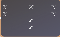
Changes/Solution :After discussing this problem with my drama group, I decided to change the positions to the ones on the below, with one X representing one person.


 There will be 3 pairs, consisting of one boy and one girl each. The girls will walk in front pridefully, and the boys will hold them, almost as if they are pushing them forward. This part shows how pride can be caused by external factors as the boys are pushing and overpraising the girls, e.g proud parents constantly telling their kids how outstanding they are, or media portraying a person as a super star etc. 

I will enter holding the cloth without a partner. I will stretch my arms out, creating a cross with my body, and then lay the cloth over my arms so that it covers the cross. The cross is meant to symbolize religion. By putting the cloth which is used in a way to show narcissism over the cross, one of the ideas I’m hoping to make the audience aware of is that pride is partly when you put yourself above God, and believe that you are greater than everything else. So to conclude, by changing my entrance, I’ve now added two more connotations to the movements. One, pride is partly caused by external factors as seen when the boys praise and flatter the girls. Two, part of pride is when you put yourself above God, which can be seen when the cloth is placed over the cross. 

The picture below shows what the new entrance looked during the dress rehearsal. 


Thursday, 1 April 2010

Pride: Snapshots from the Dress Rehearsal

Part One: Entrance


This movement is called “fast twitching”. We’re holding both our hands, and twitching and moving the hands up and down in a fairly chaotic way. 


This movement is called “slow twitching” and it’s just like the previous movement except much slower. The sharp contrast between the fast and slow movement adds a visual effect that helps to create a fascinating choreography. 


Part Two: Image One, Narcism 

This is a synced movement, which we all are supposed to do at the same time. We step over our hands and eventually sit down. For all these last three movements, we’ve hold our hands together. By holding our hands, we are “locked” into using only a limited amount of movements and this is meant to symbolize how one can be “locked” by his/her sin. 


Part Three: Image Two, Love and Obsession with Oneself

We are all improvising and doing different movements on the stage, however the concept behind them is all the same- Narcism. Furthermore, all our faces are the same in order to create a sense of unison and ensemble work.  


Finally we create different “bodies” depending on which body part we’ve fallen in love with. We are using different levels and partner work to make it look more interesting.

Sunday, 28 March 2010

Feedback from the Dress Rehearsal

During the dress rehearsal, we recorded ourself and then we watched it. Here’s my evaluation from watching it. 


Scene One: Gluttony:

We need to enter faster, the stage is empty for too long which bores the audience.

We need to work more as an ensemble to make sure that everyone has the right timing for each step.

Most steps will look great once we are synced. 

I need to think about to keep my face throughout the whole scene. I noticed that I sometimes dropped my Butoh face and went to neutral. 


Scene Two Sloth:

Once again, I need to keep my Butoh face and make sure that I face the audience.

We need to work on how we use the prop to make the movements look more real and believable. 


Scene Three Envy:

Me and Ruby works as a part and uses the technique of tracing in order to show envy. This worked very well in this scene. 


Scene Four Pride: 

The diva walk entrance was intimidating and a bit scary-which was the affect I wanted to achieve. 

The shiny cloth worked very well as a prop, and it looked aesthetically pleasing along with the projection on stage.

It was interesting to see how the projection worked with the movement on stage, and I’m pleased with how the projection I designed looked on stage. I won’t change anything about the multi media.

We need to work on the timing and make sure we are synced when we step over our hands to sit down. This is the only movement which we all do exactly the same, and therefore it’s important that we do it at the same time. 


Scene Five Lust: 

The movements looked very nice, but we really need to work on the timing.

The multimedia looked great on stage


Scene Six Wrath: 

Once again, I need to practice keeping the butoh faces throughout the whole scene. 

Make it more EXTREME! 


Scene Seven Greed: 

The props worked very well.

We need to slow down. We were moving much to fast for butoh dancers.


To conclude, the major aspects I need to work on are the faces and timing. I need to make sure I practice so that we all have the same faces and it looks unified. And we all need to practice so that we do the synced steps at the same time, to do this we need to listen to the music closely and count. E.g, look up and show the face of fear after six steps etc. 


Saturday, 20 March 2010

Costumes


Costumes:


For our performance, the girls will be wearing a light beige colored tube top and brown Thailand fishermen pants. We want to be as natural as possible, and wearing a tube top will enable us to show as much skin without the costumes becoming too sexual. All colours used with the costumes are earth and natural colors- no bright or strong colours. This is to help to emphasize the theme of nature and wilderness in Butoh. It’s important for the costumes to look natural in o


The boys will be shirtless and wear the same Thailand fisherman pants as the girl. The same type of pants provides a sense of unity, and will hopefully help to clarify and improve ensemble work. It will also make the stage look natural and balanced instead of intense and/or flashy. 


Friday, 5 March 2010

Multi Media Explanation


An important aspect of this production is multimedia. Each director is in charge of designing and creating a multimedia aspect such as a video, projection, sound etc. to complement his/her sin. For Pride, I did a projection including still images and moving animation. 


My overall aim for the projection was to clarify and emphasize important points regarding the meaning behind each movement the actors make as well as to broaden the audience’s perception about pride. I also hope the projection will add a sense of excitement and help to provoke emotions within the audience. To put together a powerful projection I used Keynote, particle illusion and Quartz composer. Particle illusion and Quartz composer helped me to create certain animations that I wished to have, on Keynote I added still images and put together the final product.


Below is a breakdown of all the images and animation I’m showing along with the meaning and aim behind them. 


The projection starts with a few simple words "I CAN. I WILL. IT IS ALL ABOUT. ME." These will be projected onto the back while the actors are entering in a movement called the “Diva walk”. The words projected shows what the actors are thinking and what they most likely would say. They are there to help clarify the feelings they actors are trying to show to the audience. 


The next two images both help to show the self-obsessed part of pride. They will also be shown during the entrance, “Diva walk”.


 I especially favor this picture on the right side, as it portrays several parts of pride. Firstly, it obviously shows the self loving and self-obsessed part of pride as she is touching he

rself. Furthermore, a peacock feather, which is the symbol for pride, is painted onto her chest. I believe this really makes the picture, as without it, the picture looks almost only sexual, with no deeper meaning behind it. The symbolism with the peacock feather adds a deeper layer of meaning to the picture. Furthermore, the woman is posing for the camera with very limited clothing, which shows that she is most likely proud of her body.


This picture shows what the words looks like. They are written in a simple, clear and bold way to make it easier for the audience. I want to keep the words simple in order to not draw too much attention from the movements, costumes and make up. Once again, these words’ -WATCH ME GO- function is the same as the previous ones- to help clarify what the feelings of the characters on stage. 


In order for the audience to hopefully further understand what the peacock has to do with pride, I choose to repeat the symbol. This image shows a woman’s face that’s half covered behind a peacock. I believe it shows how when you sin, the sin takes over and labels your body and soul as sinful according to christianity. In other words, if one commits a sin, and doesn’t repent it, God looks upon him/her as a sinner. 


The next images are to compensate for the bowl of water that I planned to use as a prop but couldn’t (see “Pride- changes along the way” for further explanation of this). Instead, I used a shiny cloth. The water is there to help convey that the cloth is acting as water, and what the characters are seeing and falling in love with is indeed their own reflection. 


This moving animation has the same message as the water pictures. I really like the colours of it, and I think it casts a nice almost mesmerizing light on the stage. Furthermore, the water droplets and rings helps to create the feeling of mesmerization, as it is a very repetitive, symmetrical and almost hallucinative. 


Finally, I choose to finish my scene with this picture. It clearly shows narcism as it is a picture of a person kissing her own reflection, with the word narcissistic below her face. I believe it’s a appropriate conclusion to the scene as it shows one of the key message I am trying to convey- narcism, in a clear and effective way.